I made a font, and a new version of 4-e
March 7, 2026 at 11:22 PM (UTC)
Is my last post seriously also about 4-e. Well, this one is too now.
I made the first few versions of 4-e in text mode because, well, it was a utility. And it was easy to get monospaced text on the screen with Tonc's Text Engine. And it worked ok!
But I really did want something a little nicer. So I took some inspiration from the backs of my e-Reader Mario cards and made a new version, learning a ton about GBA graphics along the way.
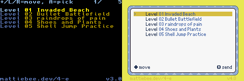
v4.0 otherwise has all the features of v3.0, a tiny handful of more user-facing niceties, but also some love and care by yours truly to make the codebase much nicer to read.
Compare:
The other neat new thing is that I made a font just for this.
I call it "four", and it's designed to be both easy to read and take up substantially less space, plus have some glyphs available for on-screen button instructions, as well as card icons.
I created the font with a classic, Usenti. On my little Windows NUC.
I liked the editor itself, but the process of getting a font out was a bit aggravating, because it was unclear what most of the options meant. Here's what I ended up using:
-
vwf (variable width font, I assume) checked.
-
1 bpp.
-
pal (palette?) unchecked.
-
0 frameclr. Color 0 is the purple I used to mask off the variable-width characters in each cell, so I think this is how Usenti detects variable widths.
-
count 128 (I have 128 characters), offset 32 (starting at 32).
-
Character width 8 (I assume vwf overrides this), height 8; cell width 8, cell height 8. Format is "tile" but I am not really clear what all the formats mean. My glyphs go left-to-right in rows.
-
I exported an ".s" file for GAS. I included a header (".h") file so my C code could find the font.
I will probably iterate on the font some more. I have other projects that could use it. I am trying not to make a whole new font editor I can use on my iPad.